Kamis, 31 Desember 2015

Latest modern science | Link roundup for December 2015 - Si Bejo Science


I�ve been tracking hacks for videos on posters for some time. Now, Pieter Torrez is working on another version of interactive posters. Read more about this here.

This poster was nominated (informally) as the best poster of the Dutch chemistry conference:


Hat tip to Vittorio Saggiomo and Megan Lynch.

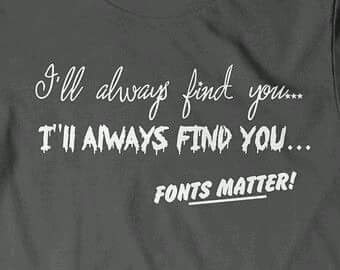
The poster above tries to make use of readily recognized symbols. But how hard is it to make a symbol that is universally recognized? Learn the origins of... Helvetica man.


Hat tip to Atlas Obscura and Ed Yong.

In Baby Attach Mode ponders whether a student should go to a conference alone. Some students have gone to conferences without me, and I�ve been fine with that. Others, I would not have suggested they go to the conference if I thought they would go on their own.

Is simplicity in design overrated?

Is it as clear as it can be? Then no one cares how complex it is. Build complex things if you need to build complex things. Just put your good design chops to work and make them as clear as you can. It�s the one thing you can do every time.

Part of a conference is about asking questions. Here�s a guide on how to do it well. Hat tip to Toby Lasserson and Anna Sharman.

Designer Ellen Lupton talks about design processes here. I like that even experienced designers still have issues picking typefaces:

Ultimately, you end up going with your gut, but looking at history and context can be a starting point.

Speaking of which, do designers ever realize they�re bad? The Dunning-Kruger effect suggests not, but this Quora thread has some interesting insights on design just the same.

Carolina G�mez reminds us that academics are unfriendly:

in a scientific congress, it�s always harder to approach the �big heads�. It�s not impossible, but circles are so established that breaking into them can be extremely difficult and truth be told, they are not very inviting to let you join. Talking with several of my friends who have left academia, I realized the feeling is a very common one. ...

The other thing about scientific conferences is the patronizing/condescending tone that some people (big wigs or not) take when asking questions after your presentations. There is always this �frenemy� vibe to these interactions: laboratories that are working in similar fields will ask questions that are aimed to throw you down, rarely to make your research better. It�s not that the questions are destructive per se (sadly, some are) but there are questions charged with dismissal of other people�s work.

What can we do to make scientific conferences more welcoming to newcomers?

Prof-Like Substance reminds us not to make figures in PowerPoint.

I just may have gotten a smartwatch in the past week. So I was primed for this story on how Fossil is going about trying to enter the smartwatch arena. I was fascinated by how clearly they prioritized design (my emphasis).

Fossil split its team in two. One team worked closely with Intel on the raw technology, making something as small and usable as possible. Another worked on the design and identity of the products themselves. If there were ever conflicts between the two, the tech team lost.

Kamis, 24 Desember 2015

Latest modern science | Lessons from the Miss Universe 2015 pageant: behind many fails lurk bad design choices - Si Bejo Science

Anyone performing live dreads screwing up. At least in theatre, it�s unlikely to be recorded. But on television, those epic fails will live on for a long time.

This weekend, everyone was talking about this year�s Miss Universe pageant. I am not particularly interested in these events, but host Steve Harvey made an astonishing mistake on live television. He named the wrong winner.


It was just terrible for everyone concerned.

But soon after the event, the card Harvey had to read was posted:


Although this article says, �it�s safe to say it wasn�t the cue card�s fault,� it�s not that cut and dry. When the card was posted on Facebook:

The post has received almost 5000 comments, many agreeing it was understandable he misconstrued the order.

Suddenly, the path to the screw-up seems much more clear. This card did not help Harvey. And the problems with this card are ones that I see on posters all the time.

First, the card doesn�t follow our expected pattern for reading. Instead of the list running from top to bottom, after two names, it suddenly veers right into unknown territory. As this article put it:

(W)hy would they put the winner all the way down at the bottom, underneath �2nd runner up� and �1st runner up?� Everyone knows what �1st� means, and that�s just confusing(.)

There�s actually a term for the phenomenon of tending to ignore things that are placed over to the right: banner blindness. In this time of high Internet use, we�ve gotten used to mostly irrelevant stuff being shoved over to the sides, so people don�t look there very much.


The positions of the three slots on the card becomes more critical when you consider the circumstances when the card is read.

Harvey first reads the card when three finalists are standing to announce the second runner up. Then, to announce the winner, Harvey reads the card when two finalists are standing. When you have two people standing, it�s easy to make the link from the two people to the two words on the left, USA and Colombia. And which one are you going to read? 

And there�s one more problem:

�Philippines�... is printed precisely where a user would likely place their thumb.

Second, the size of the text doesn�t signal importance consistently. The best design feature of this card is that �Miss Universe 2015� is set in a large point size. But the critical word, the winning contestant, is far too small. It just vanishes off the page.

If �Philippines� had been the same size as �Miss Universe 2015,� I think the chance of a mistake would have dropped way down.

One other possibility would have been to make one separate card that declared the winner, with nothing else on it, so you could not confuse the sequence. But it�s easy to say that in retrospect, knowing that Harvey made a mistake.

I like this redesign:


Another redesign is here.

This card may well become one of the most intensely scrutinized pieces of design since the �butterfly ballots� in the 2000 American presidential election.
Everyone would like to think that they could read a card like the one that was posted. It wasn�t as though the text was unclear or incorrect. All you had to do was read. But the reality is that people make mistakes, and the way you expect someone to read a card is not necessarily the way they will read it.

External links

Look at Steve Harvey�s Card � He Was Set up to Fail
Would you be confused by the Miss Universe winner�s card?
Here�s A Look At The �Miss Universe� Ballot Card That Caused Steve Harvey To Malfunction 
Steve Harvey Didn�t Ruin Miss Universe, Bad Design Did
We asked design experts if Steve Harvey's Miss Universe flub can be blamed on the ballot card
Don�t Blame Steve Harvey: Bad Design Caused the Miss Universe Fiasco
Last night�s Miss Universe screw-up could have been prevented with good UX

Hat tip to Sakshi Puri.

Kamis, 17 Desember 2015

Latest modern science | Using bad design to make a good point - Si Bejo Science

Crossposted, with slight edits, from NeuroDojo because I am way behind on grading!

Michael Eisen recently took all the journal titles off descriptions of his papers on his lab website. This upset some people, which Eisen chalked it up to �the cult of the journal title.�

Alternate hypothesis: maybe it upset people because it was a bad design decision.

In exploring design on this blog, one of the most powerful lessons I�ve learned has been that good design is about empathy. Good designers empathize with their users, anticipate their needs, and fulfill their needs.

One of the things a person going to a lab publication list wants to do is to be able to find articles that interest them. Removing journal titles makes it harder for users to find articles. And while many (but, importantly, not all) articles have DOIs and links, they are not necessarily things that people relate to as much as a journal title. If you need to scribble a reference on a piece of paper � which you often have to do at a conference � a journal name, volume, and first page number is easier than a DOI link. Change one digit in a DOI and it doesn�t work at all. A journal based citation has more forgiveness for error.

The argument that you don�t need journal titles because everything is on the Internet overlooks that the Internet doesn�t need journal articles. People do. And people don�t always have great access to the Internet, like, say, at a poster session in a conference where there is not always WiFi. People work with imperfect memories (some of us more than others) before starting a search on Google Scholar or PubMed. There are many papers that I look at, and I will never commit the DOI or link to memory. I remember the journal that papers were published in quite regularly, though. I don�t remember journals because of their Impact Factors, but because of the content of the journal, the layout and formatting, and other features. A PLOS ONE paper looks different than a PeerJ paper.

By removing a piece of information that users expect and want, Eisen is not meeting the user�s needs. Quite the opposite, he�s explicitly criticizing users who want this information. But good design is not about the designer. It�s about the experience of the end user.

That said, running in the opposite direction is no better:


This was a joke from Yoav Gilad (archived by Claus Wilke; it doesn�t look like that now). But for the sake of argument, let�s analyze it anyway. Here, the changes in text size for the journals (related to Impact Factor) is, for those outside of academia, pointless, and therefore confusing. For those in academia, it looks like an ego trip. (��Oooh, look at the fancy journal I published in!�)

Again: design is not about you.

Now, there is more to life than good design. Removing journal titles from a publication list is a successful act of advocacy against evaluation by �prestige,� which is a much-needed discussion to have. But it may be that users are upset not (only?) because of a cultish belief that journal titles are important signifiers of quality, but because they realize that the design effectively gives them the finger by leaving out something they want.

External links

What�s in a journal name?
Picture from here.

Kamis, 10 Desember 2015

Latest modern science | The next big thing... or dead thing? - Si Bejo Science

Lots of poster presentations would benefit from having something that�s hard to show on a static, flat piece of paper. The question becomes how to bring in other elements, like video. People have tried a lot of hacks, several of which I�ve described in this blog. The latest contender? Near field communication (NFC) chips.

Biochem Belle pointed me towards NFC technology, which this article says are meant to pick up where QR codes left off. Basically, NFC chips are a quicklink to the web, like QR codes. The difference is that instead of scanning a code with a phone camera, you tap your phone to a spot.

Belle asked if this could be something used on posters. My gut reaction: no. Or at least, not yet. It�s too new and unfamiliar, not transparent, and takes too much work on the part of the recipient. And what percent of phones are NFC enabled? This 2011 article suggested slightly more than half of phones would have NFC by this year. But I can only find predictions, not actual numbers for right now.

We�ve seen how QR codes are used. A few people using them on posters, but they never really took off as an enhancement to posters. NFC chips don�t seem to solve any of the issues QR codes did.

Having thought about this for a few years now, I think that the digital future of poster presentations is not in things that let you link to other sources, but in lots of big, cheap screens.

Kamis, 03 Desember 2015

Latest modern science | Lessons from sex toys: you have to let other people try things out - Si Bejo Science

And I thought I was pushing the envelope when I talked about how lingerie design could inform poster design. Well, here we go for the edge of the envelope again...

This post was inspired by the article on the design of sex toys. Once you get past the giggles inherent in talking about sex toys, it�s a very thoughtful article on design more generally, and there are lessons that can be applied to conference posters.

As I�ve mentioned before, anyone designing anything must always have empathy for the end user. That article talks about how you have to know those users in detail, not just in a vague, �they�re kind of like this� way.

For instance, if a designer is making something to be held by a hand, there are measurements for every dimension of the hand. And not just for one hand, the average hand, either � measurements exist for every dimension of the 5th and 95th percentiles of hand size as well. �But that�s just not available for designing sex toys,� (engineer Janet) Lieberman says. There is no corresponding data for vulvas. There is no official classification for the many different types of vulvas, and no sense of how common each type might be.

For conference posters, this might mean considering the average height of people, which would affect where the eye level of a reader is. You should also think about the readers who might have problems like colour blindness or presbyopia.

The part of the article that made me think the most about my own design practices, though, was the discussion of user testing. Sure, it might sound like fun at first... but think about being the first to try an untested prototype with your most sensitive bits.

(N)ot surprisingly, getting data on the efficacy of a sex toy isn�t always easy. �If you�re designing a (children�s) toy, you can put 10 kids in a room together and have them all play with that toy and get a bunch of data really quickly,� says Lieberman. But with adult products, designers and engineers are rarely present for the actual product testing, and getting feedback can be challenging. With Eva (a hands-free vibrator for use during intercourse), Lieberman found that women who tested it out struggled to describe why something did, or didn�t, work well for them. And the trials are time-consuming: a week�s worth of testing time for each pair of participants. ...

Dame Products has also employed the services of a team of gynecological teaching associates � women trained to provide medical students with hands on guidance through the particulars of performing a GYN exam � for one-on-one product testing sessions. Though the GTAs don�t provide insight on how Eva works during intercourse, they do help the Dame Products team examine how well the vibrator is secured by a wide array of labia; and, with their training in anatomy, they�re able to offer the nuanced, thoughtful feedback that many earlier testers could not.

I realized that it had been a long time since I had showed drafts of my posters to anyone else before printing them. This is dumb of me. I rehearse my presentations I give with slides. Why don�t I do something similar for posters?

Now, having written this blog for over six years, maybe I do have a little more knowledge that allows me to create something passable without having other people look at it. But that doesn�t let me off the hook for user testing.

Back in February, when I did a poster workshop, I did a little user testing, and noticed:

(T)he difference between the intended order of information, and how people actually looked at the poster. Even... posters, with a clear three column order, were not often read in that order.

How I think people will read through my posters is no guarantee that this is how they will actually read through them. There is no substitute for criticism and feedback. I badly need to get into the habit of showing my posters to others before taking them to the conference again.

As I was writing this post, I saw this on Facebook, from my buddy game designer John Wick:


FIRST RULE OF GAME DESIGN: External contact always causes dramatic change to your design.The moment you hand any game�...
Posted by John Wick on Tuesday, November 24, 2015

One problem, though, in getting proper feedback is that printing full-sized can be expensive. It would be helpful if you could print a greyscale draft version on cheap newsprint paper before going to the full-coloured glossy paper.

Finally, the article talks about another barrier to getting the feedback you need for great design: social pressures.

�The only difference I noticed [between designing mainstream and adult products] was the stigma� that was attached to designing a vibrator compared to another consumer electronic product,� says B�har.

People don�t want to talk about their experience with sex toys. (See this probably NSFW this Sex in the City clip about the reluctance to talk about them and the difficulty in getting user feedback.) I�m willing to bet that when most people get a badly made sex toy, about all that happens is silent grumbling to themselves. There are strong conventions about keeping sexual experiences private, so it takes a certain amount of courage even to leave a one star review on an online shopping site.

There�s a similar social stigma about calling out bad posters or presentations at conferences. We might say, �Did you see that?� sotto voce at the conference lunch table. We might write a tweet. But to say to a speaker at the time, �The design of your poster needs work� doesn�t happen all that often, because we�re worried about being rude. And that�s impeding our ability to get better posters and presentations.

Related posts

Lessons from lingerie
More lessons from lingerie: details versus decoration

External links

Why aren�t vibrators as good as other gadgets?
Let�s stop enabling bad speakers

Hat tip to Gerty Z. Picture from here.

Kamis, 26 November 2015

Latest modern science | Link roundup for November 2015 - Si Bejo Science

Posters are a visual medium. But not everyone sees equally well, and I�ve written about taking factors like colour blindness or presbyopia into account in design. But I had not considered the challenges faced by a blind presenter, which makes this article absolutely fascinating.


Ashleigh Gonzales (pink blouse on left) is blind, and her poster is on converting flat images to three-dimensional ones that could be felt by blind students. I�m fascinated that Ashleigh�s poster (abstract here), has Braille in the title and headings. I can�t make out whether this is actually readable Braille (i.e., raised paper) or not, but would love to find out more.

The Society for Neuroscience introduced �dynamic posters� a few years ago, and the response has been... well, flat. As it happens, I have not made it to this conference since these have been introduced, so I haven�t had a chance to see, or create, one myself. I�m tickled that the Neuwrite blog has a long post detailing the creation of a dynamic poster. To be honest, dipping into the process of creating something that truly exploits the dynamic format is intimidating:

My goal this year was to make my �dynamic� poster interactive. ... I didn�t know how to do any of this, but I new it is possible and that, with a bit of effort, I could figure it out. A �bit of effort� turned out to be 6 weeks of sleepless nights(.)

But the results are pretty amazing. Go to the post to see these in models that you can rotate and zoom.


The PLOS Paleo blog has started a series about academic conferences. Their first entry tries to characterize the type of people who attend conferences.

With this potential range of attendees in mind, there is no single uniform audience at a scientific conference.

Looking forward to more!

Apple has long been recognized as a company that spends a lot of time thinking about design. But former employees takes the company to task for forgetting the user (not to mention a few swipes at other products, like Google Maps):

Gone are the fundamental principles of good design: discoverability, feedback, recovery, and so on. Instead, Apple has, in striving for beauty, created fonts that are so small or thin, coupled with low contrast, that they are difficult or impossible for many people with normal vision to read. We have obscure gestures that are beyond even the developer�s ability to remember. We have great features that most people don�t realize exist.

Probably the deepest article in this month�s round-up. Hat tip to Clause Wilke and Leonard Kruglyak.

Vox magazine makes the argument that Y axes shouldn�t always start at zero.


I try not to be a zealot about things, but in general, starting axes at zero is a better practice than not. Will there be exceptions? Sure. As the Vox video points out, if you have negative numbers, you have to extend past zero.

One thing that Vox overlooks is that there is a standard way to extend a section of a graph: it�s to insert a break in the axis. It alerts a viewer to the non-standard start.

KatieSci on Twitter:

Presentation Preference choices for #EB16 abstract submission: Oral, Poster, Indifferent. The �Indifferent� is kind of cracking me up.

The �indifferent� abstracts are like this:


PeachPit Press asked Jim Krause for typography tips. I like these:

Explore your font choices THOROUGHLY before picking a winner.

Combine fonts that are either clearly alike or clearly different. Middle-ground=bad

Hat tip to Garr Reynolds.

Kamis, 19 November 2015

Latest modern science | Critique: SAS depot - Si Bejo Science

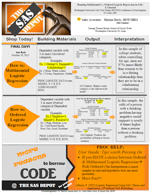
Today�s poster come from Maxine Davis, which she did for a small conference. Click to enlarge!

There are a couple of things that are very successful on this poster. The colour scheme is very cohesive, helped by the poster being a pastiche of Home Depot branding. As I�ve said before, basing a poster on an existing colour or branding scheme is a handy shortcut, because they�re tried and tested designs that you know will work.


The yellow highlighting breaks the colour scheme slightly, but it is so effective at drawing attention to key elements of the text that it is okay.

The poster clearly shows that it is meant to be read in rows, so there is no problem in determining reading order. The big orange �How to� balloons on the left are very good guides.

Still, there is probably too much going on in this poster. I suspect that the individual sections might looking fine when you�re looking at part of the poster, but when you step back, there is a lot of stuff competing for attention.

The typesetting is a little frantic. I count at least six different typefaces, which I�ve highlighted below:


Even when the typeface is the same, there�s a lot of other variations that contribute to the feeling of mild disorganization (bullets, bolding, boxes, italics, highlighting, rotation...). Wider margins might also bring a needed sense of calm to the poster.

I like the idea of having the top left image acting as an entry point (and making the homage to Home Depot obvious), but the execution is compromised because the picture is distorted. The store logo should be square, like so:


I would have kept the image in its original, slightly narrower form, and made more room for the subtitle over at the right.

While it�s not visible in thumbnail, there are some overlap and ragged edge problems between the image anf the author credits:

I�m not sure about the winking face next to the name. Some will find it friendly; some will find it frivolous. Home Depot employees do have buttons and badges on their store aprons, and this might potentially be continuing the imitation of the flair of Home Depot staff. But it�s not quite a match, and I feel that if you�re going to follow the design of something, you need to go all the way.

This poster is off to a good start, but would benefit from a very thorough polish of the text, with attention to making the text more consistent across the poster.

Kamis, 12 November 2015

Latest modern science | Critique: 3D sound - Si Bejo Science

Today�s poster comes from Erlend Magnus Viggen. Click to enlarge!


Erlend had a few notes on this creation.

Since the article is about a computational method that we developed, the poster is a flowchart of the method.

The flowchart works reasonably well, although the reading order of the �Propogation� box in the upper right is a little tricky. If there was a little more room, I might try placing �Sound processing� slightly lower than the text block flanking it. That way, the �Source sound� and �Propogation� would sort of funnel down into �Sound processing.� But this poster has a nice balance of text and margins, and you couldn�t move �sound processing� down without messing with that.

There�s no introduction. I�m not sure to which degree an introduction beyond the title is useful on a poster in any case, but in this case our method is far more relevant for our conference audience than our motivation is. Our use-case is basically outside the scope of the conference.

Smart move, and an excellent example of how designs are often improved by taking things away.

I like how subtle colour gradients are used to distinguish blocks of text instead of heavy-handed outlines.

I�m particularly interested by Erlend�s comments about using institutional styles. I�ve been wary of institutional style guides, because they often prioritize advertising the institution over the content that a poster viewer cares about. Erlend, I think, takes a sensible approach:

I tried to follow the guidelines of my research institute: use a grid, use the official typeface (though I only used it for headers as it�s more of a display typeface), and use colours from the official scheme. While there are more colours in the official scheme, the dark blue one is our main colour and the light gray-brown is the only bright-ish colour among our �main� colours.

Erlend isn�t slavishly following a template, but looking for ways to use elements of the institution�s style. Institutional colour schemes are usually closely examined by professional designers, so you end up with palettes that are harmonious, and maybe a little conservative. The colours should work in lots of different conditions. And you don�t have to use every official colour.

I did something similar recently, when I made a new logo for my homepage. I deliberately wanted to harmonize it with my institution�s logo:


Like Erlend�s case, my university has navy blue and green as secondary colours, but I didn�t use those. I used the same primary colours and font (Caecilia), and customized a swishy capital:


By using the institutional typeface for headings, you evoke the institution in a subtle way. It�s got more finesse than just shoving a logo somewhere on the page. And if you do put in a logo, you avoid having a lot of different fonts fighting each other.

I'm not too happy with not having more pictures, but unfortunately we just don't have any more that would fit well.

Alas! I agree that more graphics and a little less text would be more appealing. Nevertheless, this poster has enough space on it that it doesn�t become an indistinguishable block of grey from a distance.

Related posts

Misplaced priorities on institutional templates

Kamis, 05 November 2015

Latest modern science | Casing a poster - Si Bejo Science

I�m fascinated by the ways people recycle posters. Traditionally, posters are one-shot ephemera, which usually gotten reuse only by decorating department hallways. While fabric posters has some shortcomings for display compared to high quality paper posters, I have to admit: the reuse possibilities are much greater.

Christie Rowe has been steadily converting her posters into these awesome pencil cases! She shared this with me back in September:


And here�s some more finished ones.


The earth tones come naturally for Christie, who is in an Earth & Planetary Sciences department.


Data flash!


Kamis, 29 Oktober 2015

Latest modern science | Link roundup for October 2015 - Si Bejo Science

A feature in The Atlantic asks a big question: Can posters still change the world? I�m unsure posters have ever changed the world, but no matter. Still a great article on the power of the poster format. Hat tip to Siobhan O�Dwyer.

The latest demonstration of how fonts affect interpretation...


Hat tip to Jim Ducharme and Danielle Lee.

I am an advocate of one space after a period. However, I appreciate this spirited defense of wider spacing after a period. In particular, the historical aspect of this blog post is well worth reading.

If the (early editions) Chicago Manual thought it was okay to use large spaces after periods, and it had been common practice among the typographers who invented these typefaces, can we seriously claim that the only right method to set them is with a single space after a period? I CANNOT BELIEVE THE GALL OF MODERN TYPOGRAPHERS, ARGUING THAT THE PRACTICE OF THOSE WHO CREATED THEIR FONTS IS ABSOLUTELY, UNEQUIVOCALLY �WRONG.�

Make it all the way to the post-script if you can. I still say the single space is the modern standard (this post has the single space winning out around the 1940s), and you shouldn�t put put spaces after a period. Hat tip to Robert J. Sawyer, from his Facebook page.


Above you see a nice critique and makeover of a poster. Not a scientific poster, but still. Take a few minutes to let John McWade walk you through the process in a nice video.

The British Library adds over a million public domain images to Flickr.

The title of this article � Should you ever use a pie chart? � is a bit misleading. It includes a lot of history as well as best practices.


Hat tip to Justin Kiggins, if I remember right.

This month is the huge Neuroscience conference, possibly home to more academic posters than anything else on the planet. Don�t believe me? Check this panorama from Dwayne Godwin:


Before the meeting, people sent tips! From Lauren Drogos:

Let people pause and read before trying to engage at your poster, some of us are shy and need a moment to muster.

Andrew Pruszynski wrote:

Meeting new people is the only reason to go to SFN. The posters/talks are just pretext.

I appreciate the sentiment, but I would replace �only� with �main.� I find seeing talks and posters useful. I find catching up with people I know useful.

And from Drugmonkey:

Think of your poster design as a massive troll. The point is to engender conversation!!!

Though I don�t necessarily think you should put this on your poster...


From the meeting:

Peer review: shit just got real. (From Dr. Jenn)


And there is the inevitable aftermath of deciding how to use posters after the session is done. Tal Yarkoni has decided they are a fine place to rest one�s weary bones.


A critique of common scientific presentations: �Your protein acronyms and figures look nothing more than ambiguous letters and Pac-Man shapes to us.�

Sabtu, 24 Oktober 2015

Latest modern science | Is your font in the right decade? - Si Bejo Science


I recently watched a double feature of Village of the Damned (1960) and Children of the Damned (1964). I was completely fascinated by the contrast between the two films. Even though the latter is ostensibly a sequel, instead of continuity, the two movies feel like mirror images on every level, thematically and stylistically.

Although released in 1960, Village of the Damned is at heart a 1950s film. It�s just at the tail end of that era of science fiction filmmaking. This carried over into the movie�s title in the credits: a serif typeface, in quote marks. Playing against an ivy covered wall just accentuates the pastoral feel.


Now look at the contrast in the title of Children of the Damned. I don�t think it�s Helvetica, but it�s something in that family: a �scrape away the crap� grotesque sans serif. The title appears over an urban setting. You just couldn�t imagine that title card on a film from the 1950s. Children of the Damned is absolutely a film of the 1960s.


In just a few short years, everything had changed graphically.

I could go on about the differences between the films, but this is a design blog, not the movie review blog. But it got me wondering: does your poster look like it�s in the right decade?

As it happens, this is the twentieth anniversary of Windows 95. Windows 95 wasn�t the first PC operating system to have TrueType fonts, but it broke a lot of ground for digital typography for the average user. The font list for Windows 95 included Arial, Times New Roman, Courier, and (shudder) Comic Sans.

Many posters have not moved past those font choices from twenty years ago. Lots of posters are set in Arial, Times New Roman, and sometimes even (shudder) Comic Sans.

Admittedly, some typefaces have staying power. Decades-old Futura appeared on a list of most popular web fonts last year. Nevertheless, typography has moved on. Styles have changed.

If I were to try to pinpoint some of the trends I see in type:

Thin is in. Designers are using a lot of lighter lines for fonts. I think this is related to the development of very high resolution screens (300 dots per inch, in some cases). Fine lines can hold up very well on high resolution screens. I don�t think it�s an accident that Calibri Light got added to the roster of default Windows fonts a while back.

Flat design. Again related to the propensity to design things that look good on small but very high resolution screens, simple, geometric typefaces are seeing a lot of use now. Nine of the ten fonts on this list of popular web fonts fit that description. Here�s a list of examples. It�s instructive to look at what Google images throws up, too. It�s a very distinct aesthetic.

Angular momentum. This one is hard for me to describe, because I�m not a trained type expert. But I�ve noted that when you look down at the detailing, many modern serifs have some angled lines, rather than smooth curves. Here�s a new font, PF Occula, that shows some of this:


Does your poster look like a product of the twentieth-first century... or the twentieth?

Kamis, 08 Oktober 2015

Latest modern science | Critique: CEOs - Si Bejo Science

This week�s contribution is from Christine Haskell, who was nice enough to share. Click to enlarge!


Chistine writes:

I�ve seen a number of these now and no one reads their poster, it�s used as more of a discussion tool. I therefore chose a visual, a mobile, to reflect the short and long term balance leaders need to manage their strategies. I will have handouts with references for people to takeaway.

I love the graphic approach using the mobile. It�s awesome. It�s the sort of bold choice that you don�t see often on academic posters, because it�s hard to pull off. It�s super effective.

I worry a bit if breaking up the title along the mobile hides it too much. The individual words are large and readable, but it took me a couple of passes to realize that the phrase �How do purposeful CEOs� leads to �experience growth� leads to �in their organizaions?�, and that it�s all one sentence.

More subtle is that the letters in the title don�t always follow their lines as closely as one might like. Particularly the bottom one, "in their organizations?" is diverging and drifting higher than the line below it.

There�s variation in the spacing between letters. �How do purposeful...� is much tighter than �Experience growth.�

Christina replied:

I�ve reached my graphic-capability threshold. I did this in PowerPoint, and need to move on to other things like writing articles and looking for consulting. I can�t figure out how to make those pesky curves behave better.


Down in 5B, I�m not a fan of the underlining of �Values have lifecycles.� Italics alone does the job.

That sections 4, 5, and 6 each have different bullet styles is a minor inconsistency that Chirstine admitted she just caught at the end. Thus obeying the Law of Maximum Inconvenience.

Jumat, 02 Oktober 2015

Latest modern science | Posters in the humanties - Plus! Critique: Safety - Si Bejo Science


Today�s poster comes from Joschka Haltaufderheid. Before I get to a critique of the posters, I want to start addressing something Joaschka wrote in the email accompanying the poster:

(F)or researchers in the humanities, making a good poster seems to be quite challenging. Normally we do not present empirical results but rather lines of arguments, considerations of pros and cons, ideas, etc. That makes it very hard to balance text and graphical elements in a proper way since we first need lots of words and second do not have any figures, tables or diagrams at hand.

This is something I�ve thought about more than I�ve written about. Different disciplines in the humanities will likely have different tools at their disposal. Historians might have images of artifacts. Those studying literature will have texts. Both might have representations of the people they are discussing.

But, if you are in a situation where your main tools are words, there are two skills you need to master: editing and typography.

I�ve talked before about how uninviting long blocks of text are. You must find ways to convey your key point in as few words as possible. You must be ruthless about editing your text. Try to find a few, choice, tweetable phrases, and highlight those. People love aphorisms.

You can turn words into graphic elements with good typography. Compare this bit of text:

Give thy thoughts no tongue. - Hamlet, Act 1, Scene 3

Sure, you could put that bit of text on a poster like that. Or you could put it like this:


Magazines and newspapers turn words into graphic elements all the time. Pull quotes. Drop caps.The choice of typeface and colour. These are not simple techniques to master, but they can give a text-based poster a graphic appeal that a document does not.

On with Joschka�s poster, which is used with his permission. Click to enlarge!


The accompanying picture of the sign is a good attention getter, and a signal that viewers will understand. There may not be enough contrast between the sign and the text where the two overlap, however. Look at the words on top of the �TY� in �SAFETY�, for example. Some slight repositioning might allow you to keep the interesting overlap with less conflict between the image and text.

I love how the title is handled. It�s given plenty of white space around it so that nothing competes with it for attention.

The rest of the poster reminds me very much of international typographic style that was popular in the 1960s. It�s a very modernist look using a sans serif typeface and a strong grid.

A few changes in typesetting could make the text less intimidating. The �Background� section appears as one text block, the right indentation indicates its meant to be read as two paragraphs. These paragraphs might be separated by a bit more space, indents, or both.

Similarly, a little more space between the headings and the text below might be useful in emphasizing the headings.

The figures are helpful graphic elements and well placed, although the top of Figure 1 comes too close to touching the text above it.

Overall, this is a strong design. I�m intrigued that the design strikes me as very �European.� I wonder if I could have guessed where Joschka is writing from.

Kamis, 24 September 2015

Latest modern science | Link roundup for September 2015 - Si Bejo Science

FoxTrot starts off this month�s link roundup...


Hat tip to J.D. Wikert.

�What�s that font?� Trying to identify a font is one of those tasks that, until recently, was something that in many cases could only be done by someone with a near encyclopedic knowledge in type design. Indentifont is a good tool for the rest of us. It walks you through a series of questions, and makes suggestions all the way.

Using Identifont, I was able to nail down the typeface on this book cover as a slightly compressed ITC Fenice...


And my new institution�s new logo as PMN Caecilia with a customized rockin� R. Bold, specifically.


Pro tip! Check the suggestions after every question. I found that sometimes, Identifont would make a correct suggestion that would go away after I answered more questions. I don�t know why, but there it is.

Be it resolved that:

It is unethical to present the same scientific poster at more than one meeting.

Drugmonkey started the debate; read the replies to the tweet for people�s responses.

There is an entire blog of free academic images. A promising resource, although it is a bit difficult to browse and search. For example, although this blog is all about images, it is entirely written in plain text.

Here are five reasons to go to conferences. Hat tip to Paige Jarreau.

How Scientific American makes its infographics. Quote from one of the illustrators:

The designer must realize that things are always more complicated than they seem. Particularly in any biological science. Moreover, any kind of catchy headlines like �we share 99 percent of DNA�, while not entirely wrong, are ultimately useless because they tell people nothing. Journalists must dig for surprising, engaging stories that reveal and manage complexity to the reader.

Hat tip to StoryBench and John Rennie.

Kamis, 17 September 2015

Latest modern science | Critique: The social network - Si Bejo Science

Something about this looks familiar. Today�s poster comes from Igor Miklou�ic. Click to enlarge!


I love this idea. I�ve talked before about how it can be so helpful to base a poster off an existing design. Make a poster about Facebook look like Facebook. Brilliant. It immediately helps viewers recognize what they�re in for.

The poster runs into problems because it doesn�t follow the Facebook format closely enough! Facebook posts are usually short, and accompanied by a picture. Instead, we get some sizable blocks of text with no pictures, and they look gray and uninviting at a distance:


This is a limitation of copying another design. The design of a poster would benefit from changing the text size. But following the design of Facebook means you can�t, because then it won�t look like Facebook, which is, after all, the point.

This might be fixed by a substantial restructure of the middle of the poster to break the big posts into several small ones, perhaps with a few graphics. This would not be a simple change, but might be worthwhile.

Kamis, 10 September 2015

Latest modern science | Critique: Quality mitochondria - Si Bejo Science

Today�s poster comes from Arunas Radzvilavicius, and is shown with his kind permission. Click to enlarge!


The layout, the colour, the generous space, the use of graphic touches are all things to like on this poster. It�s very nice. But sometimes, a poster�s own worst critic is its designer. Arunas wrote:

The optimal amount of text on the poster is something I still can't seem to get right. I always seem to reduce the amount of text to the possible minimum, but that often leads to the poster becoming unintelligible to people not familiar with the details of my research.

How much to write on a poster is always a challenge, although most academics have the opposite problem of Arunas and leave in far, far too much.

The low amount of text is inviting to a reader from a distance, but perhaps confusing when you get up close. Here�s the start:

Isogamy: mitochondria inherited from only one (UPI) or both (BPI) mating types. Ancestral metazoan state. BPI if mutation rate was low.

This is so condensed, it�s close to shorthand. I struggle to revise this into full sentences, because some of the logical connections between words have been erased by the editing. I think this might be close to true:

In isogamy, mitochondria are inherited from one (uniparental isogamy, or UPI) or both (uniparental isogamy, or BPI) mating types. Isogamy is the ancestral metazoan state, with BPI favoured if the mutation rate was low.

Full sentences add more clarity than they take up space.

Seeing this poster shrunk down, it might benefit from the headings being a little more prominent. The poster is a little dark overall, and the reduced contrast dos not help the headings to �pop.� Likewise, using all capitals for the headings make them a little harder to read from a distance.

Kamis, 03 September 2015

Latest modern science | Critique and makeover: PrimerMiner - Si Bejo Science

Today�s poster comes from Vasco Elbrecht. Before I get to his poster, Vasco has a whole series of YouTube videos on making posters in InDesign, so you might want to check those out!

On to the poster that Vasco sent to me and let me share it with you. Click to enlarge!


My first reaction was that there�s a lot going on in this poster. It was a little overwhelming and intimidating.

The layout of the poster isn�t to blame for the feeling of busyness. The structure of the poster is actually reasonably clear and easy to follow.

A lot of the feeling of busyness has to do with the colours. Looking at it felt a like looking at a busy city�s business district:


There are five big blocks of colour on this poster: a red box, a green box, a yellow note, and orange note, and a light blue sidebar. And there is the data at the bottom, which also uses bright primary colours.

There may not be much that can be done about the data at the bottom, but the other five blocks might benefit from being more similar. Here is a quick and dirty example:


This redesign points out that the logos are also contributing to the business. Three of the five are dark blue, which isn�t in line with the rest of the poster. The dark blue blocks are also competing with the title for attention: the position says �the logos are important� (Cosmo principle), when the title should be most important.

Again, a quick revision that tries to bring the title out by repositioning and shrinking the logos (the title size is the same):


Now the emphasis is clearly on the title. Shrinking the logos helped emphasize the title by creating more white space to separate the title from everything else. The overall effect is a little calmer and more approachable.

Let�s revert back to the original colour scheme for a moment and have another look at that.


Over on the left hand side, the brightly coloured boxes again create a problem of emphasis. The highlighted colours and boxes, particularly from a distance, say, �I�m important, read me first!� The text supports this, too: �The problem� and �The solution� are in bold, and meant as key summaries.

If all the graphic and text cues say, �read me first,� why not put them first?


Some of the things I like about this poster? This poster has uneven sections, but there are visual signals that make it easy to follow. The lines between the columns is better done than on many posters, providing a clear guide that isn�t overwhelming. The use of subtle �A,� �B,� �C� icons help make the order clear and add a nice graphic touch. The sidebar clearly signals stuff which is nonessential to the main presentation of the poster. The spot for stickies is also a nice invitation for interaction.

City photo from here.