Kamis, 29 Oktober 2015

Latest modern science | Link roundup for October 2015 - Si Bejo Science

A feature in The Atlantic asks a big question: Can posters still change the world? I�m unsure posters have ever changed the world, but no matter. Still a great article on the power of the poster format. Hat tip to Siobhan O�Dwyer.

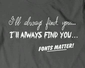
The latest demonstration of how fonts affect interpretation...


Hat tip to Jim Ducharme and Danielle Lee.

I am an advocate of one space after a period. However, I appreciate this spirited defense of wider spacing after a period. In particular, the historical aspect of this blog post is well worth reading.

If the (early editions) Chicago Manual thought it was okay to use large spaces after periods, and it had been common practice among the typographers who invented these typefaces, can we seriously claim that the only right method to set them is with a single space after a period? I CANNOT BELIEVE THE GALL OF MODERN TYPOGRAPHERS, ARGUING THAT THE PRACTICE OF THOSE WHO CREATED THEIR FONTS IS ABSOLUTELY, UNEQUIVOCALLY �WRONG.�

Make it all the way to the post-script if you can. I still say the single space is the modern standard (this post has the single space winning out around the 1940s), and you shouldn�t put put spaces after a period. Hat tip to Robert J. Sawyer, from his Facebook page.


Above you see a nice critique and makeover of a poster. Not a scientific poster, but still. Take a few minutes to let John McWade walk you through the process in a nice video.

The British Library adds over a million public domain images to Flickr.

The title of this article � Should you ever use a pie chart? � is a bit misleading. It includes a lot of history as well as best practices.


Hat tip to Justin Kiggins, if I remember right.

This month is the huge Neuroscience conference, possibly home to more academic posters than anything else on the planet. Don�t believe me? Check this panorama from Dwayne Godwin:


Before the meeting, people sent tips! From Lauren Drogos:

Let people pause and read before trying to engage at your poster, some of us are shy and need a moment to muster.

Andrew Pruszynski wrote:

Meeting new people is the only reason to go to SFN. The posters/talks are just pretext.

I appreciate the sentiment, but I would replace �only� with �main.� I find seeing talks and posters useful. I find catching up with people I know useful.

And from Drugmonkey:

Think of your poster design as a massive troll. The point is to engender conversation!!!

Though I don�t necessarily think you should put this on your poster...


From the meeting:

Peer review: shit just got real. (From Dr. Jenn)


And there is the inevitable aftermath of deciding how to use posters after the session is done. Tal Yarkoni has decided they are a fine place to rest one�s weary bones.


A critique of common scientific presentations: �Your protein acronyms and figures look nothing more than ambiguous letters and Pac-Man shapes to us.�

Sabtu, 24 Oktober 2015

Latest modern science | Is your font in the right decade? - Si Bejo Science


I recently watched a double feature of Village of the Damned (1960) and Children of the Damned (1964). I was completely fascinated by the contrast between the two films. Even though the latter is ostensibly a sequel, instead of continuity, the two movies feel like mirror images on every level, thematically and stylistically.

Although released in 1960, Village of the Damned is at heart a 1950s film. It�s just at the tail end of that era of science fiction filmmaking. This carried over into the movie�s title in the credits: a serif typeface, in quote marks. Playing against an ivy covered wall just accentuates the pastoral feel.


Now look at the contrast in the title of Children of the Damned. I don�t think it�s Helvetica, but it�s something in that family: a �scrape away the crap� grotesque sans serif. The title appears over an urban setting. You just couldn�t imagine that title card on a film from the 1950s. Children of the Damned is absolutely a film of the 1960s.


In just a few short years, everything had changed graphically.

I could go on about the differences between the films, but this is a design blog, not the movie review blog. But it got me wondering: does your poster look like it�s in the right decade?

As it happens, this is the twentieth anniversary of Windows 95. Windows 95 wasn�t the first PC operating system to have TrueType fonts, but it broke a lot of ground for digital typography for the average user. The font list for Windows 95 included Arial, Times New Roman, Courier, and (shudder) Comic Sans.

Many posters have not moved past those font choices from twenty years ago. Lots of posters are set in Arial, Times New Roman, and sometimes even (shudder) Comic Sans.

Admittedly, some typefaces have staying power. Decades-old Futura appeared on a list of most popular web fonts last year. Nevertheless, typography has moved on. Styles have changed.

If I were to try to pinpoint some of the trends I see in type:

Thin is in. Designers are using a lot of lighter lines for fonts. I think this is related to the development of very high resolution screens (300 dots per inch, in some cases). Fine lines can hold up very well on high resolution screens. I don�t think it�s an accident that Calibri Light got added to the roster of default Windows fonts a while back.

Flat design. Again related to the propensity to design things that look good on small but very high resolution screens, simple, geometric typefaces are seeing a lot of use now. Nine of the ten fonts on this list of popular web fonts fit that description. Here�s a list of examples. It�s instructive to look at what Google images throws up, too. It�s a very distinct aesthetic.

Angular momentum. This one is hard for me to describe, because I�m not a trained type expert. But I�ve noted that when you look down at the detailing, many modern serifs have some angled lines, rather than smooth curves. Here�s a new font, PF Occula, that shows some of this:


Does your poster look like a product of the twentieth-first century... or the twentieth?

Kamis, 08 Oktober 2015

Latest modern science | Critique: CEOs - Si Bejo Science

This week�s contribution is from Christine Haskell, who was nice enough to share. Click to enlarge!


Chistine writes:

I�ve seen a number of these now and no one reads their poster, it�s used as more of a discussion tool. I therefore chose a visual, a mobile, to reflect the short and long term balance leaders need to manage their strategies. I will have handouts with references for people to takeaway.

I love the graphic approach using the mobile. It�s awesome. It�s the sort of bold choice that you don�t see often on academic posters, because it�s hard to pull off. It�s super effective.

I worry a bit if breaking up the title along the mobile hides it too much. The individual words are large and readable, but it took me a couple of passes to realize that the phrase �How do purposeful CEOs� leads to �experience growth� leads to �in their organizaions?�, and that it�s all one sentence.

More subtle is that the letters in the title don�t always follow their lines as closely as one might like. Particularly the bottom one, "in their organizations?" is diverging and drifting higher than the line below it.

There�s variation in the spacing between letters. �How do purposeful...� is much tighter than �Experience growth.�

Christina replied:

I�ve reached my graphic-capability threshold. I did this in PowerPoint, and need to move on to other things like writing articles and looking for consulting. I can�t figure out how to make those pesky curves behave better.


Down in 5B, I�m not a fan of the underlining of �Values have lifecycles.� Italics alone does the job.

That sections 4, 5, and 6 each have different bullet styles is a minor inconsistency that Chirstine admitted she just caught at the end. Thus obeying the Law of Maximum Inconvenience.

Jumat, 02 Oktober 2015

Latest modern science | Posters in the humanties - Plus! Critique: Safety - Si Bejo Science


Today�s poster comes from Joschka Haltaufderheid. Before I get to a critique of the posters, I want to start addressing something Joaschka wrote in the email accompanying the poster:

(F)or researchers in the humanities, making a good poster seems to be quite challenging. Normally we do not present empirical results but rather lines of arguments, considerations of pros and cons, ideas, etc. That makes it very hard to balance text and graphical elements in a proper way since we first need lots of words and second do not have any figures, tables or diagrams at hand.

This is something I�ve thought about more than I�ve written about. Different disciplines in the humanities will likely have different tools at their disposal. Historians might have images of artifacts. Those studying literature will have texts. Both might have representations of the people they are discussing.

But, if you are in a situation where your main tools are words, there are two skills you need to master: editing and typography.

I�ve talked before about how uninviting long blocks of text are. You must find ways to convey your key point in as few words as possible. You must be ruthless about editing your text. Try to find a few, choice, tweetable phrases, and highlight those. People love aphorisms.

You can turn words into graphic elements with good typography. Compare this bit of text:

Give thy thoughts no tongue. - Hamlet, Act 1, Scene 3

Sure, you could put that bit of text on a poster like that. Or you could put it like this:


Magazines and newspapers turn words into graphic elements all the time. Pull quotes. Drop caps.The choice of typeface and colour. These are not simple techniques to master, but they can give a text-based poster a graphic appeal that a document does not.

On with Joschka�s poster, which is used with his permission. Click to enlarge!


The accompanying picture of the sign is a good attention getter, and a signal that viewers will understand. There may not be enough contrast between the sign and the text where the two overlap, however. Look at the words on top of the �TY� in �SAFETY�, for example. Some slight repositioning might allow you to keep the interesting overlap with less conflict between the image and text.

I love how the title is handled. It�s given plenty of white space around it so that nothing competes with it for attention.

The rest of the poster reminds me very much of international typographic style that was popular in the 1960s. It�s a very modernist look using a sans serif typeface and a strong grid.

A few changes in typesetting could make the text less intimidating. The �Background� section appears as one text block, the right indentation indicates its meant to be read as two paragraphs. These paragraphs might be separated by a bit more space, indents, or both.

Similarly, a little more space between the headings and the text below might be useful in emphasizing the headings.

The figures are helpful graphic elements and well placed, although the top of Figure 1 comes too close to touching the text above it.

Overall, this is a strong design. I�m intrigued that the design strikes me as very �European.� I wonder if I could have guessed where Joschka is writing from.

Kamis, 24 September 2015

Latest modern science | Link roundup for September 2015 - Si Bejo Science

FoxTrot starts off this month�s link roundup...


Hat tip to J.D. Wikert.

�What�s that font?� Trying to identify a font is one of those tasks that, until recently, was something that in many cases could only be done by someone with a near encyclopedic knowledge in type design. Indentifont is a good tool for the rest of us. It walks you through a series of questions, and makes suggestions all the way.

Using Identifont, I was able to nail down the typeface on this book cover as a slightly compressed ITC Fenice...


And my new institution�s new logo as PMN Caecilia with a customized rockin� R. Bold, specifically.


Pro tip! Check the suggestions after every question. I found that sometimes, Identifont would make a correct suggestion that would go away after I answered more questions. I don�t know why, but there it is.

Be it resolved that:

It is unethical to present the same scientific poster at more than one meeting.

Drugmonkey started the debate; read the replies to the tweet for people�s responses.

There is an entire blog of free academic images. A promising resource, although it is a bit difficult to browse and search. For example, although this blog is all about images, it is entirely written in plain text.

Here are five reasons to go to conferences. Hat tip to Paige Jarreau.

How Scientific American makes its infographics. Quote from one of the illustrators:

The designer must realize that things are always more complicated than they seem. Particularly in any biological science. Moreover, any kind of catchy headlines like �we share 99 percent of DNA�, while not entirely wrong, are ultimately useless because they tell people nothing. Journalists must dig for surprising, engaging stories that reveal and manage complexity to the reader.

Hat tip to StoryBench and John Rennie.

Kamis, 17 September 2015

Latest modern science | Critique: The social network - Si Bejo Science

Something about this looks familiar. Today�s poster comes from Igor Miklou�ic. Click to enlarge!


I love this idea. I�ve talked before about how it can be so helpful to base a poster off an existing design. Make a poster about Facebook look like Facebook. Brilliant. It immediately helps viewers recognize what they�re in for.

The poster runs into problems because it doesn�t follow the Facebook format closely enough! Facebook posts are usually short, and accompanied by a picture. Instead, we get some sizable blocks of text with no pictures, and they look gray and uninviting at a distance:


This is a limitation of copying another design. The design of a poster would benefit from changing the text size. But following the design of Facebook means you can�t, because then it won�t look like Facebook, which is, after all, the point.

This might be fixed by a substantial restructure of the middle of the poster to break the big posts into several small ones, perhaps with a few graphics. This would not be a simple change, but might be worthwhile.

Kamis, 10 September 2015

Latest modern science | Critique: Quality mitochondria - Si Bejo Science

Today�s poster comes from Arunas Radzvilavicius, and is shown with his kind permission. Click to enlarge!


The layout, the colour, the generous space, the use of graphic touches are all things to like on this poster. It�s very nice. But sometimes, a poster�s own worst critic is its designer. Arunas wrote:

The optimal amount of text on the poster is something I still can't seem to get right. I always seem to reduce the amount of text to the possible minimum, but that often leads to the poster becoming unintelligible to people not familiar with the details of my research.

How much to write on a poster is always a challenge, although most academics have the opposite problem of Arunas and leave in far, far too much.

The low amount of text is inviting to a reader from a distance, but perhaps confusing when you get up close. Here�s the start:

Isogamy: mitochondria inherited from only one (UPI) or both (BPI) mating types. Ancestral metazoan state. BPI if mutation rate was low.

This is so condensed, it�s close to shorthand. I struggle to revise this into full sentences, because some of the logical connections between words have been erased by the editing. I think this might be close to true:

In isogamy, mitochondria are inherited from one (uniparental isogamy, or UPI) or both (uniparental isogamy, or BPI) mating types. Isogamy is the ancestral metazoan state, with BPI favoured if the mutation rate was low.

Full sentences add more clarity than they take up space.

Seeing this poster shrunk down, it might benefit from the headings being a little more prominent. The poster is a little dark overall, and the reduced contrast dos not help the headings to �pop.� Likewise, using all capitals for the headings make them a little harder to read from a distance.