Tampilkan postingan dengan label critiques. Tampilkan semua postingan

Kamis, 21 Januari 2016

Latest modern science | Critique: Thale cress RNA - Si Bejo Science

Today�s poster is from Andrzej Zielezinski. It was shown at the twentieth annual meeting of the RNA Society last year. Click to enlarge!


This poster feels very contemporary and in tune with the times. The style is very close to �flat design� seen a lot on the web: clean, primary colours, sans serif type, very little shading. (Indeed, the website mentioned on the poster has a similar aesthetic.) I love how the core of the poster (the intro, methods, and results) looks.

The abstract is problematic. At a distance or shrunk down, that big rectangle in the upper left just dominates the poster�s visuals. It draws you in, and give you... blocks of text as a reward.

I would have tried to lighten up that block so it isn�t so visually dominant. In this quick and dirty redo, I�ve made the text that nice green, for emphasis, but put the box into a lighter, more neutral grey.


It�s not quite right, but I think the balance is a little better. The better solution would be to remove it entirely!

The grey stripes in the background are subtle enough that they are not overwhelming. Like the abstract, however, they might be lightened up around the edges f the poster a bit. The stripes are running at three different angles, too: the set running across the bottom is not lining up with the upper left. And if the stripes are going to radiate out from the center of the poster, maybe they should do that in all the corners.

The title bar is unusual: very few people right align their titles, because that�s not where we are trained to read. In this case, because you have that big abstract block in the upper left, having the title on the left too would have been far too much. Having space around the abstract block helps the overall look of the poster.

The title text feels a little light. Because it is set in a low contrast light green in a thin font, with a few grey stripes behind it, it might not be easily readable or noticeable from a distance.

I�m a little puzzled that a website link shows up in two places: under the authors� affiliations, and down in the bottom green bar. I would be tempted to have it in one place alone. My instinct would be to cut the top one, so I could make the title and author�s section a bit roomier, or maybe larger.

Similarly, I can�t quite figure out why two logos are sensibly corralled in the bottom, while one is taking a primo spot in the title bar. I�m guessing the one in the title is the institution and the others are funding agencies?

The genus and species names (Arabidopis thaliana) are not in italics anywhere. My reaction:


Jumat, 15 Januari 2016

Latest modern science | Critique: Sea turtles eating trash - Si Bejo Science

This week�s poster is like those �Spot the difference� cartoons that used to appear in the classified ad section of newspapers (dating myself there). Qamar Schuyler sent me a work in progress, so there are two versions. You can click either to enlarge!


There�s a lot to like. The sea turtle provides a clear cue as to what this poster is about. I wonder if a picture of a turtle ingesting debris might be an even better indicator of the poster�s topic. The trade-off could be that a poster of a turtle in trouble might be disheartening and a turn-off to a potential reader. Maybe the healthy, charismatic turtle used here is the right choice.

The main data, the maps, are up front and center. The big coloured map is placed just where it should be: right in the upper middle. The caption for it, though, is a little problematic, because it�s been severed from the image it describes.


In general, you want to place descriptive text as close to the image it�s linked to as possible.

A similar problem occurs with the smaller maps. While they don�t have to be read in any particular order, they do wind around, snake-like, between the colour map and the captions.


Part of the problem here is that five maps are the same size, and one � for Kemp�s Ridley sea turtle � is narrower. I would still try to put these in a more consistent two by three grid, and just suck up that the last one isn�t a perfect fit. Perhaps the figure caption could slot into the extra space, maybe like this:


Or this:


Of course, I�ve cheated in the sketches above because I haven�t relocated any of the text. Repositioning the figures would require a massive revision of the right side of the poster, perhaps moving the �Results� section into the upper right corner.

Here�s Qamar�s tweaked version. Spot the differences!


Some of the differences I caught (not intended to be an exhaustive list):

  • The box around the conclusions has been given a red border to �pop� the take home message. I like it.
  • A graph has been added to results. I like this, too. Visuals are better than words.
  • A poster number has been added. I�m very mildly against this, because I��m not sure it does much besides take up space. On the other hand, it is unobtrusive and might help someone.
  • The proportions have changed a little.
  • The �Contact me� box in the lower right has been tweaked a bit, and is better aligned with the box above it. I would like it more if it was the same width as the box above, though.

You can see this poster with Qamar at the Ocean Sciences meeting in New Orleans in February. If you can�t make it to the Big Easy, you can read the pre-print of the article here.

Reference

Schuyler QA, Wilcox C, Townsend KA, Wedemeyer-Strombe KR, Balazs G, van Sebille E, Hardesty, BD. 2015. Risk analysis reveals global hotspots for marine debris ingestion by sea turtles. Global Change Biology: in press. http://dx.doi.org10.1111/gcb.13078

Kamis, 19 November 2015

Latest modern science | Critique: SAS depot - Si Bejo Science

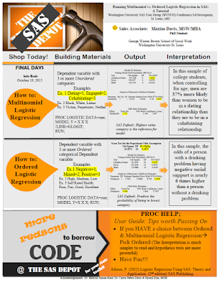
Today�s poster come from Maxine Davis, which she did for a small conference. Click to enlarge!

There are a couple of things that are very successful on this poster. The colour scheme is very cohesive, helped by the poster being a pastiche of Home Depot branding. As I�ve said before, basing a poster on an existing colour or branding scheme is a handy shortcut, because they�re tried and tested designs that you know will work.


The yellow highlighting breaks the colour scheme slightly, but it is so effective at drawing attention to key elements of the text that it is okay.

The poster clearly shows that it is meant to be read in rows, so there is no problem in determining reading order. The big orange �How to� balloons on the left are very good guides.

Still, there is probably too much going on in this poster. I suspect that the individual sections might looking fine when you�re looking at part of the poster, but when you step back, there is a lot of stuff competing for attention.

The typesetting is a little frantic. I count at least six different typefaces, which I�ve highlighted below:


Even when the typeface is the same, there�s a lot of other variations that contribute to the feeling of mild disorganization (bullets, bolding, boxes, italics, highlighting, rotation...). Wider margins might also bring a needed sense of calm to the poster.

I like the idea of having the top left image acting as an entry point (and making the homage to Home Depot obvious), but the execution is compromised because the picture is distorted. The store logo should be square, like so:


I would have kept the image in its original, slightly narrower form, and made more room for the subtitle over at the right.

While it�s not visible in thumbnail, there are some overlap and ragged edge problems between the image anf the author credits:

I�m not sure about the winking face next to the name. Some will find it friendly; some will find it frivolous. Home Depot employees do have buttons and badges on their store aprons, and this might potentially be continuing the imitation of the flair of Home Depot staff. But it�s not quite a match, and I feel that if you�re going to follow the design of something, you need to go all the way.

This poster is off to a good start, but would benefit from a very thorough polish of the text, with attention to making the text more consistent across the poster.

Kamis, 12 November 2015

Latest modern science | Critique: 3D sound - Si Bejo Science

Today�s poster comes from Erlend Magnus Viggen. Click to enlarge!


Erlend had a few notes on this creation.

Since the article is about a computational method that we developed, the poster is a flowchart of the method.

The flowchart works reasonably well, although the reading order of the �Propogation� box in the upper right is a little tricky. If there was a little more room, I might try placing �Sound processing� slightly lower than the text block flanking it. That way, the �Source sound� and �Propogation� would sort of funnel down into �Sound processing.� But this poster has a nice balance of text and margins, and you couldn�t move �sound processing� down without messing with that.

There�s no introduction. I�m not sure to which degree an introduction beyond the title is useful on a poster in any case, but in this case our method is far more relevant for our conference audience than our motivation is. Our use-case is basically outside the scope of the conference.

Smart move, and an excellent example of how designs are often improved by taking things away.

I like how subtle colour gradients are used to distinguish blocks of text instead of heavy-handed outlines.

I�m particularly interested by Erlend�s comments about using institutional styles. I�ve been wary of institutional style guides, because they often prioritize advertising the institution over the content that a poster viewer cares about. Erlend, I think, takes a sensible approach:

I tried to follow the guidelines of my research institute: use a grid, use the official typeface (though I only used it for headers as it�s more of a display typeface), and use colours from the official scheme. While there are more colours in the official scheme, the dark blue one is our main colour and the light gray-brown is the only bright-ish colour among our �main� colours.

Erlend isn�t slavishly following a template, but looking for ways to use elements of the institution�s style. Institutional colour schemes are usually closely examined by professional designers, so you end up with palettes that are harmonious, and maybe a little conservative. The colours should work in lots of different conditions. And you don�t have to use every official colour.

I did something similar recently, when I made a new logo for my homepage. I deliberately wanted to harmonize it with my institution�s logo:


Like Erlend�s case, my university has navy blue and green as secondary colours, but I didn�t use those. I used the same primary colours and font (Caecilia), and customized a swishy capital:


By using the institutional typeface for headings, you evoke the institution in a subtle way. It�s got more finesse than just shoving a logo somewhere on the page. And if you do put in a logo, you avoid having a lot of different fonts fighting each other.

I'm not too happy with not having more pictures, but unfortunately we just don't have any more that would fit well.

Alas! I agree that more graphics and a little less text would be more appealing. Nevertheless, this poster has enough space on it that it doesn�t become an indistinguishable block of grey from a distance.

Related posts

Misplaced priorities on institutional templates

Kamis, 08 Oktober 2015

Latest modern science | Critique: CEOs - Si Bejo Science

This week�s contribution is from Christine Haskell, who was nice enough to share. Click to enlarge!


Chistine writes:

I�ve seen a number of these now and no one reads their poster, it�s used as more of a discussion tool. I therefore chose a visual, a mobile, to reflect the short and long term balance leaders need to manage their strategies. I will have handouts with references for people to takeaway.

I love the graphic approach using the mobile. It�s awesome. It�s the sort of bold choice that you don�t see often on academic posters, because it�s hard to pull off. It�s super effective.

I worry a bit if breaking up the title along the mobile hides it too much. The individual words are large and readable, but it took me a couple of passes to realize that the phrase �How do purposeful CEOs� leads to �experience growth� leads to �in their organizaions?�, and that it�s all one sentence.

More subtle is that the letters in the title don�t always follow their lines as closely as one might like. Particularly the bottom one, "in their organizations?" is diverging and drifting higher than the line below it.

There�s variation in the spacing between letters. �How do purposeful...� is much tighter than �Experience growth.�

Christina replied:

I�ve reached my graphic-capability threshold. I did this in PowerPoint, and need to move on to other things like writing articles and looking for consulting. I can�t figure out how to make those pesky curves behave better.


Down in 5B, I�m not a fan of the underlining of �Values have lifecycles.� Italics alone does the job.

That sections 4, 5, and 6 each have different bullet styles is a minor inconsistency that Chirstine admitted she just caught at the end. Thus obeying the Law of Maximum Inconvenience.

Jumat, 02 Oktober 2015

Latest modern science | Posters in the humanties - Plus! Critique: Safety - Si Bejo Science


Today�s poster comes from Joschka Haltaufderheid. Before I get to a critique of the posters, I want to start addressing something Joaschka wrote in the email accompanying the poster:

(F)or researchers in the humanities, making a good poster seems to be quite challenging. Normally we do not present empirical results but rather lines of arguments, considerations of pros and cons, ideas, etc. That makes it very hard to balance text and graphical elements in a proper way since we first need lots of words and second do not have any figures, tables or diagrams at hand.

This is something I�ve thought about more than I�ve written about. Different disciplines in the humanities will likely have different tools at their disposal. Historians might have images of artifacts. Those studying literature will have texts. Both might have representations of the people they are discussing.

But, if you are in a situation where your main tools are words, there are two skills you need to master: editing and typography.

I�ve talked before about how uninviting long blocks of text are. You must find ways to convey your key point in as few words as possible. You must be ruthless about editing your text. Try to find a few, choice, tweetable phrases, and highlight those. People love aphorisms.

You can turn words into graphic elements with good typography. Compare this bit of text:

Give thy thoughts no tongue. - Hamlet, Act 1, Scene 3

Sure, you could put that bit of text on a poster like that. Or you could put it like this:


Magazines and newspapers turn words into graphic elements all the time. Pull quotes. Drop caps.The choice of typeface and colour. These are not simple techniques to master, but they can give a text-based poster a graphic appeal that a document does not.

On with Joschka�s poster, which is used with his permission. Click to enlarge!


The accompanying picture of the sign is a good attention getter, and a signal that viewers will understand. There may not be enough contrast between the sign and the text where the two overlap, however. Look at the words on top of the �TY� in �SAFETY�, for example. Some slight repositioning might allow you to keep the interesting overlap with less conflict between the image and text.

I love how the title is handled. It�s given plenty of white space around it so that nothing competes with it for attention.

The rest of the poster reminds me very much of international typographic style that was popular in the 1960s. It�s a very modernist look using a sans serif typeface and a strong grid.

A few changes in typesetting could make the text less intimidating. The �Background� section appears as one text block, the right indentation indicates its meant to be read as two paragraphs. These paragraphs might be separated by a bit more space, indents, or both.

Similarly, a little more space between the headings and the text below might be useful in emphasizing the headings.

The figures are helpful graphic elements and well placed, although the top of Figure 1 comes too close to touching the text above it.

Overall, this is a strong design. I�m intrigued that the design strikes me as very �European.� I wonder if I could have guessed where Joschka is writing from.

Kamis, 17 September 2015

Latest modern science | Critique: The social network - Si Bejo Science

Something about this looks familiar. Today�s poster comes from Igor Miklou�ic. Click to enlarge!


I love this idea. I�ve talked before about how it can be so helpful to base a poster off an existing design. Make a poster about Facebook look like Facebook. Brilliant. It immediately helps viewers recognize what they�re in for.

The poster runs into problems because it doesn�t follow the Facebook format closely enough! Facebook posts are usually short, and accompanied by a picture. Instead, we get some sizable blocks of text with no pictures, and they look gray and uninviting at a distance:


This is a limitation of copying another design. The design of a poster would benefit from changing the text size. But following the design of Facebook means you can�t, because then it won�t look like Facebook, which is, after all, the point.

This might be fixed by a substantial restructure of the middle of the poster to break the big posts into several small ones, perhaps with a few graphics. This would not be a simple change, but might be worthwhile.