Latest modern science | Critique: Rein it in - Si Bejo Science
critiques textOpening up reader submissions for this blog is interesting. Sometimes, I make an audible sound when I first see the poster. Sort of a sharp intake of breath. Not quite a gasp. The sot of noise you make in the passenger seat and you see a car coming towards you and you�re not sure if the driver has seen it and you can�t hit the brakes or steer?
Maybe not quite that bad, but... it�s not a good sound.
Then there are times when you open up the file, and think, �Well, dang, am I going to have anything to write about that?�
Today�s contribution is more in the latter category than the first. It comes from Sourav Chakraborty, who gave me the okay to show this to you. Click to enlarge!
Sourav was inspired by a poster by Josefine K�hberger on this very blog, in fact. The result is a nice, clean, attractive poster. There is not a huge amount of text. The layout is clear. The base colours are subdued neutral shades (which I think is one of the main influences from Josefine�s poster), with brighter colours used to good effect for emphasis and highlighting, particularly in the code.
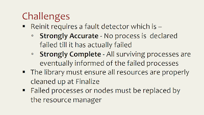
This poster uses bulleted lists, which I generally don�t like. Let�s have a closer look:
This list might be improved by creating a stronger and more distinct hierarchy between the different levels. The main bullets are black squares, and the secondary bullets are black circles.
It�s good that the two levels have different shapes and sizes, but the differences are not that big. I might try reducing the point size Particularly from a distance (or when reduced in size on the screen), the squares and circles look pretty similar. If you�re going to use different levels of lists, you want to make it clear that they are different.
Here�s a quick change to make them more distinct: a hollow circle instead of a filled one.
The difference alone is not enough: you also want to make sure that the differences work in the right direction following expectations of hierarchy. Here�s an example, where I create the same difference (hollowing a symbol), but the other way around:
Lightening the squares works against viewer�s expectations. You�ve made something important lower contrast, making is less noticeable, signalling that it is less important, not more. But the position says it�s more important, not less.
Here�s one more revision where I shrunk the secondary bullets to about 80% of the original, again to create a bigger difference between the different levels of text hierarchy.
Now it�s clearer which are the main points, and which are the secondary points.
Egalitarianism is great socially, but it�s not so great in text design.
Related posts
Bullets versus sentences


